Have you ever noticed that some websites instantly feel trustworthy, premium, and organized — while others look chaotic?
Most beginners think it’s layout.
But in reality, color decisions make a massive difference.
If you’re learning SEO, branding, UI/UX, or building a WordPress website, understanding what is color theory will completely change how you design and communicate visually.
This guide will give you everything — from fundamentals to practical application.
What Is Color Theory? (Clear Definition)
Color theory is a structured system of principles that explains how colors interact, how they create harmony, and how they influence perception and emotions.
In simple words:
Color theory helps you choose colors intentionally to communicate the right message.
It combines:
- The color wheel
- Color harmony rules
- Color psychology
- Visual hierarchy
- Contrast and accessibility
- Branding strategy
Color is not decoration.
Color is communication.
The Origin of the Color Wheel
The modern color wheel concept was introduced by Isaac Newton, who discovered that white light splits into a spectrum.
He arranged colors in a circular format to show relationships.
That circular system became the foundation of modern color theory.
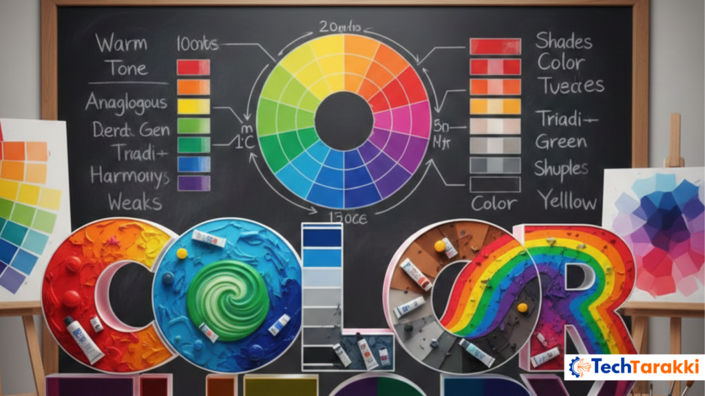
Understanding the Color Wheel
The color wheel is the foundation of color theory and helps designers understand how colors relate to each other.
Primary Colors
- Red
- Blue
- Yellow
These cannot be created by mixing other colors.
Secondary Colors
- Orange
- Green
- Purple
Created by mixing primary colors.
Tertiary Colors
- Red-Orange
- Yellow-Green
- Blue-Green
Created by mixing primary + secondary colors.
The wheel helps designers create balanced combinations.
Types of Color Harmony (Color Combinations)
Color harmony means combining colors in a visually pleasing way.
Complementary Scheme
Opposite colors on the wheel.
Examples:
- Blue & Orange
- Red & Green
Why It Works
Creates strong contrast.
Best For
- CTA buttons
- Sales banners
- Alerts
Risk
Overuse feels aggressive.
Analogous Scheme
Colors next to each other.
Example:
Blue, Blue-Green, Green.
Why It Works
Feels natural and smooth.
Best For
- Backgrounds
- Blog layouts
- Lifestyle brands
Monochromatic Scheme
Different shades and tints of one color.
Why It Works
Minimal and professional.
Best For
- Corporate websites
- Personal branding
Split-Complementary Scheme
One base color + two adjacent opposite colors.
Balanced contrast.
Best For
- SaaS websites
- Startup landing pages
Triadic Scheme
Three evenly spaced colors.
Example:
Red, Yellow, Blue.
Balanced yet vibrant.
Tetradic Scheme
Two complementary pairs.
Complex but rich.
Best for large brand systems.
Understanding Color Properties
This is where most beginners get confused.
Hue
Pure color name.
Example: Blue.
Tint
Hue + White.
Lightens color.
Used for:
- Soft backgrounds
- Friendly UI
Shade
Hue + Black.
Darkens color.
Used for:
- Depth
- Strong headings
Tone
Hue + Gray.
Makes color muted and professional.
Common in modern corporate branding.
Saturation
Intensity of color.
High saturation → Bright
Low saturation → Soft
Value
Lightness or darkness.
High value → Light
Low value → Dark
These properties help create visual hierarchy.
Which Color Should You Use Where?
| Color | Emotion | Best Use | Avoid For |
| Red | Urgency | Sale banners | Full page background |
| Blue | Trust | Corporate websites | Aggressive promotions |
| Green | Growth | Health brands | Emergency alerts |
| Yellow | Attention | Highlights | Long text |
| Black | Luxury | Premium brands | Kids products |
| Purple | Creativity | Beauty industry | Banking |
| Orange | Action | CTA buttons | Serious government sites |
Color Theory in Branding
Major brands use color intentionally:
- Coca-Cola → Red
- Facebook → Blue
- Starbucks → Green
Color improves recognition dramatically.
Choose:
✔ 1 Primary
✔ 1 Secondary
✔ 1 Accent
Color Theory in UX & Visual Hierarchy
Color guides attention.
Example:
Bright button + neutral background = Higher click rate.
Contrast separates sections.
Hierarchy improves:
- Readability
- Engagement
- Conversion
Accessibility & Contrast Ratio (WCAG Basics)
WCAG recommends minimum contrast ratios for readability.
Avoid:
- Light gray on white
- Yellow text on white
- Using only color for errors
Accessibility improves UX and SEO indirectly.
Common Mistakes Beginners Make
- Using too many bright colors
- Ignoring saturation balance
- No consistent brand palette
- Poor contrast
- Random color selection
Design should feel intentional.
Advanced Pro Tips
- Use 60-30-10 rule (60% primary, 30% secondary, 10% accent)
- Test color combinations in grayscale
- Check accessibility contrast tools
- Maintain brand consistency
Quick Cheat Sheet
Hue = Pure color
Tint = + White
Shade = + Black
Tone = + Gray
Complementary = High contrast
Analogous = Smooth harmony
Monochromatic = Clean look
Conclusion: What Is Color Theory?
So, what is color theory?
It is the science and strategy of combining colors intentionally to create harmony, influence emotion, and improve user experience.
When you understand color theory, your designs become purposeful instead of random.
That’s the difference between amateur and professional design.